


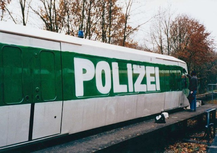
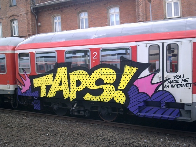
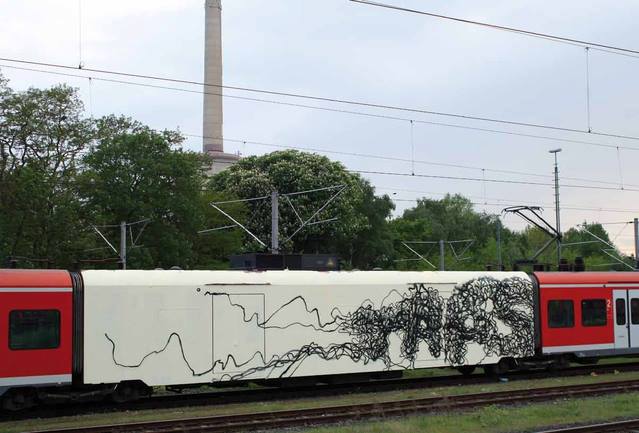
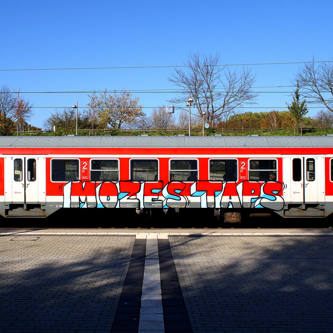
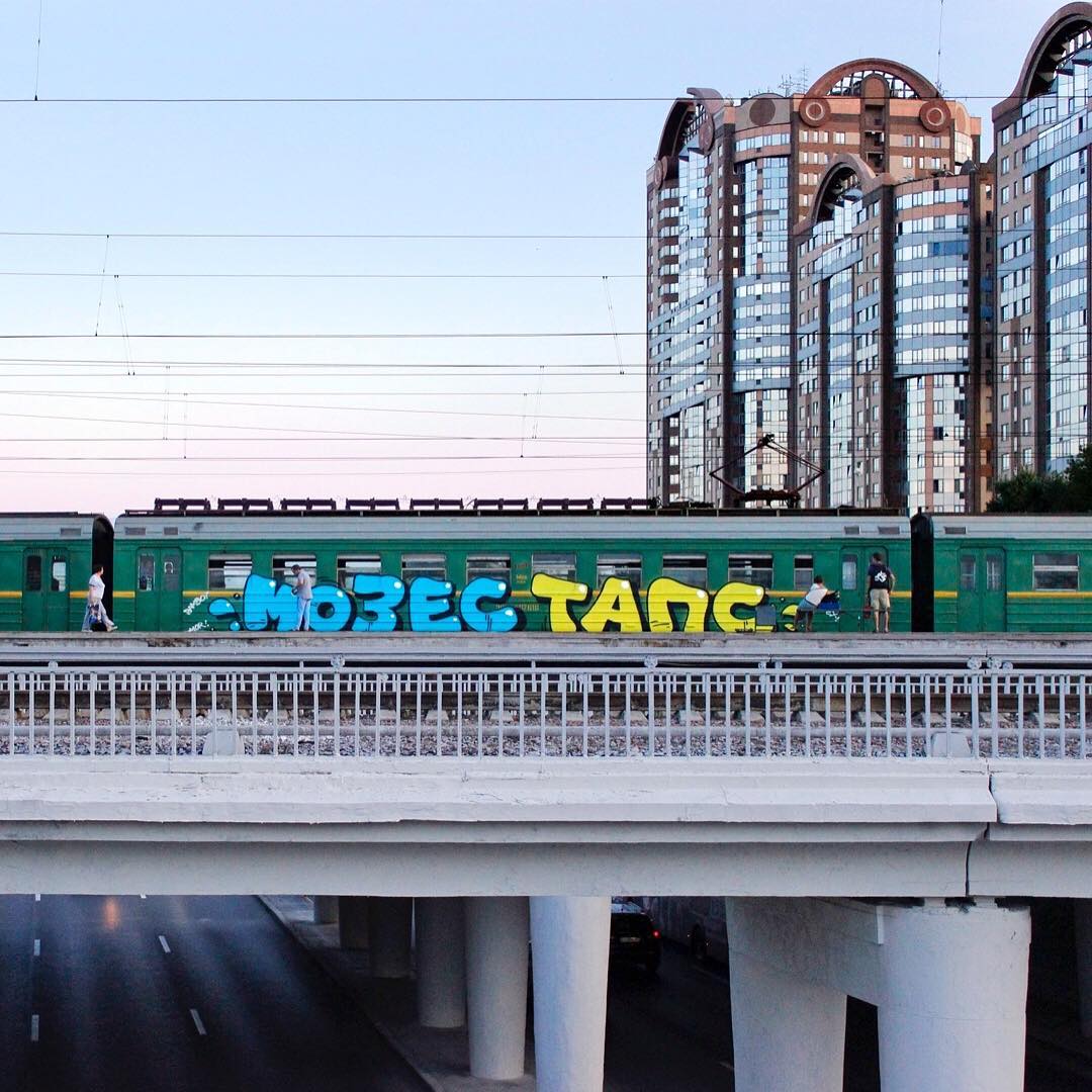
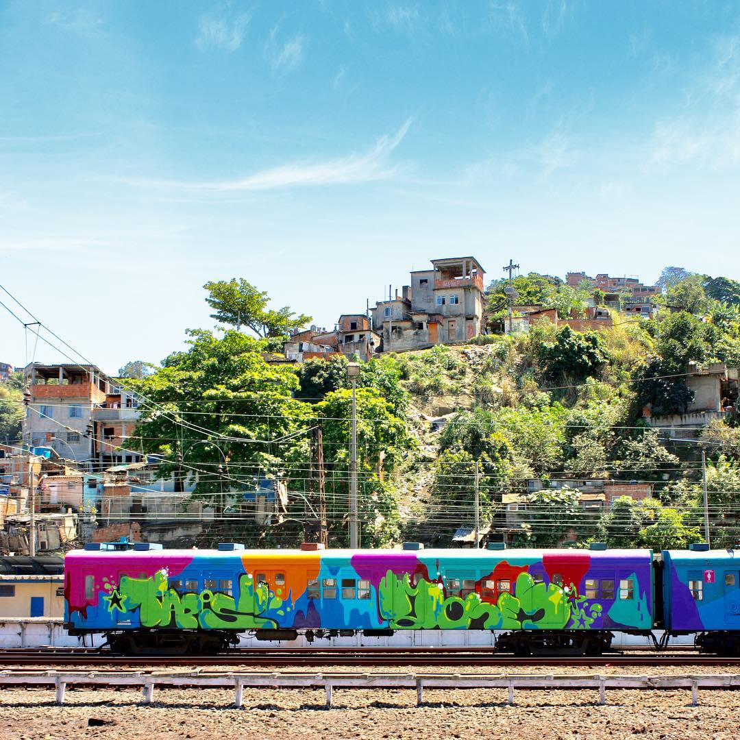
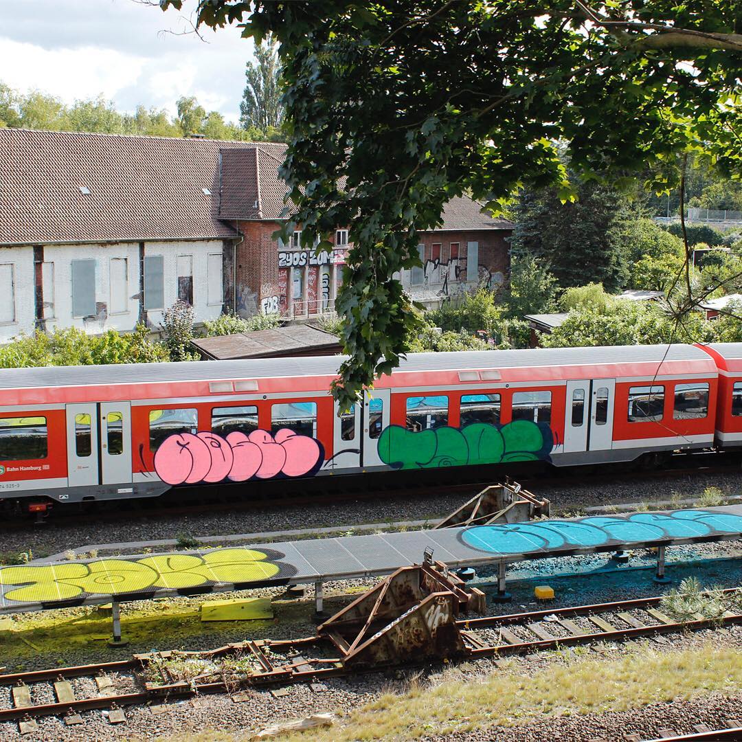
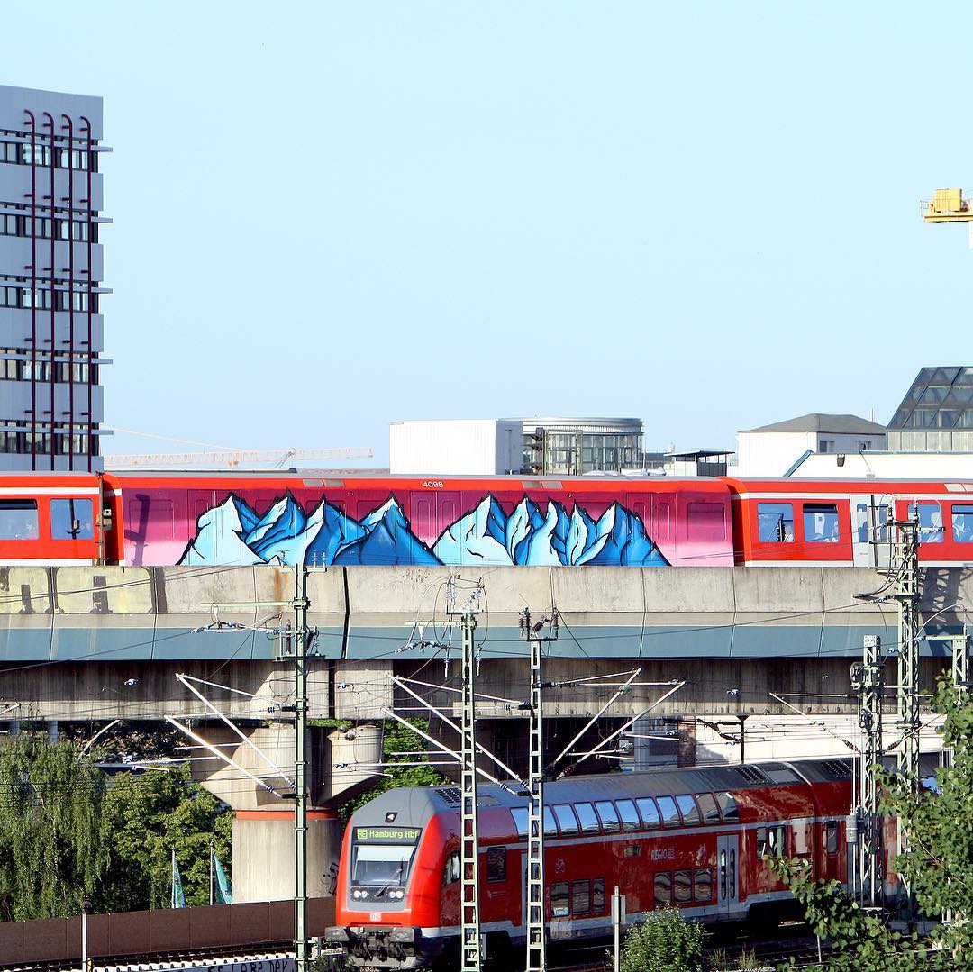
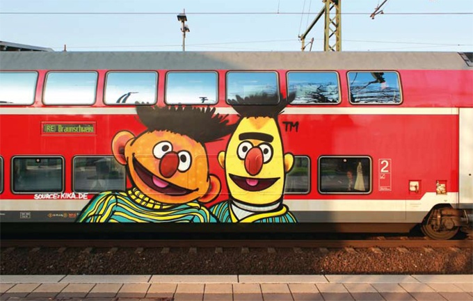
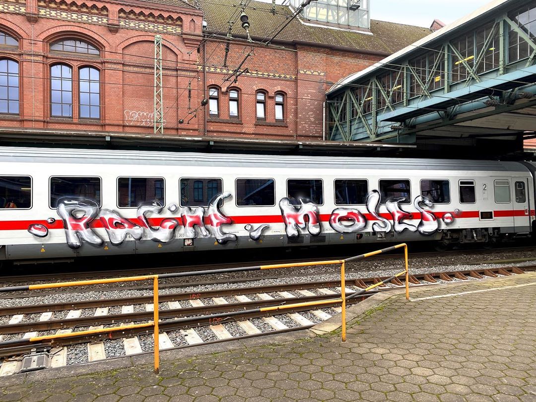
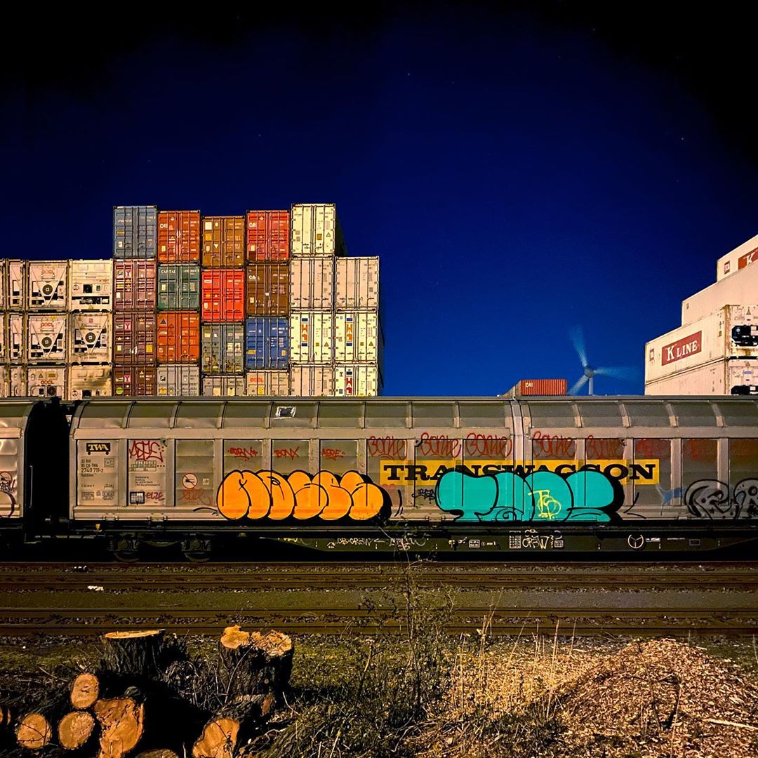
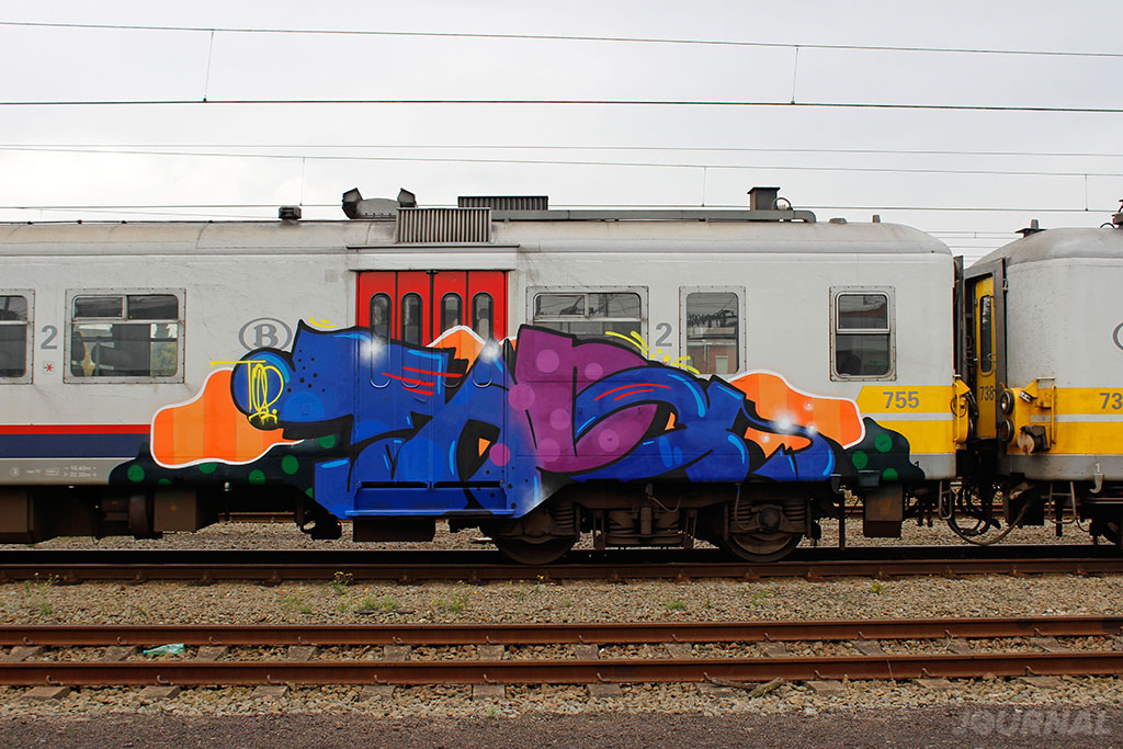
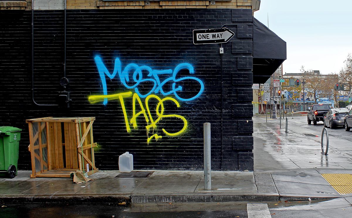
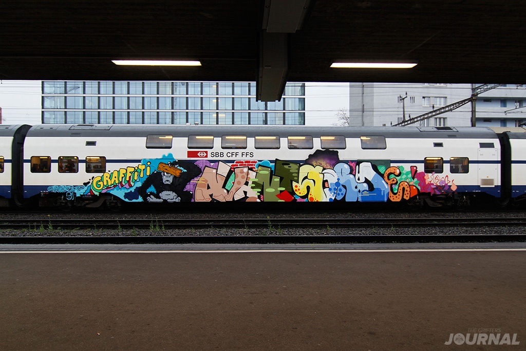
MOSES & TAPS are currently the most prominent players of an artistic genre which is so current that it has no fixed name as of today; Urban Art, Post-graffiti, conceptual and performance art – everything is right and nothing fits.
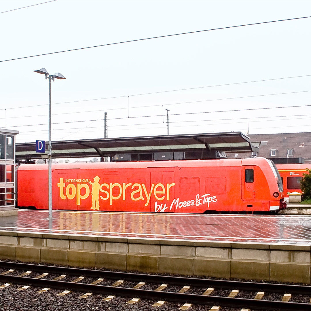
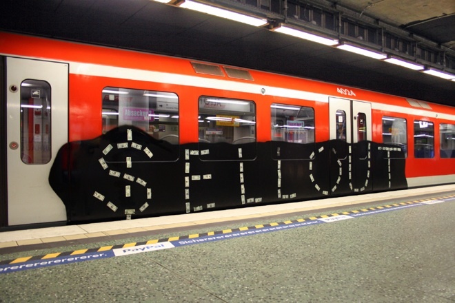
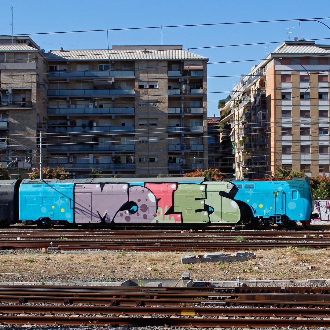
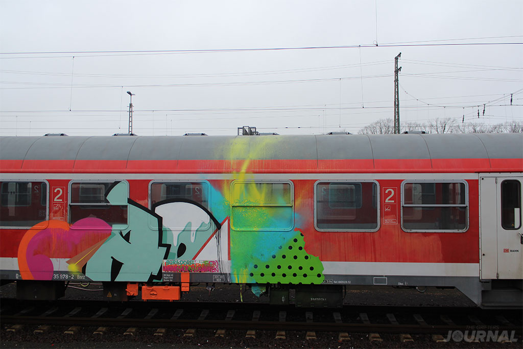
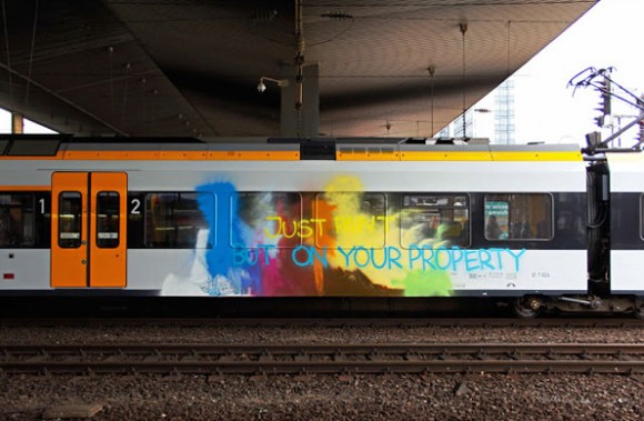
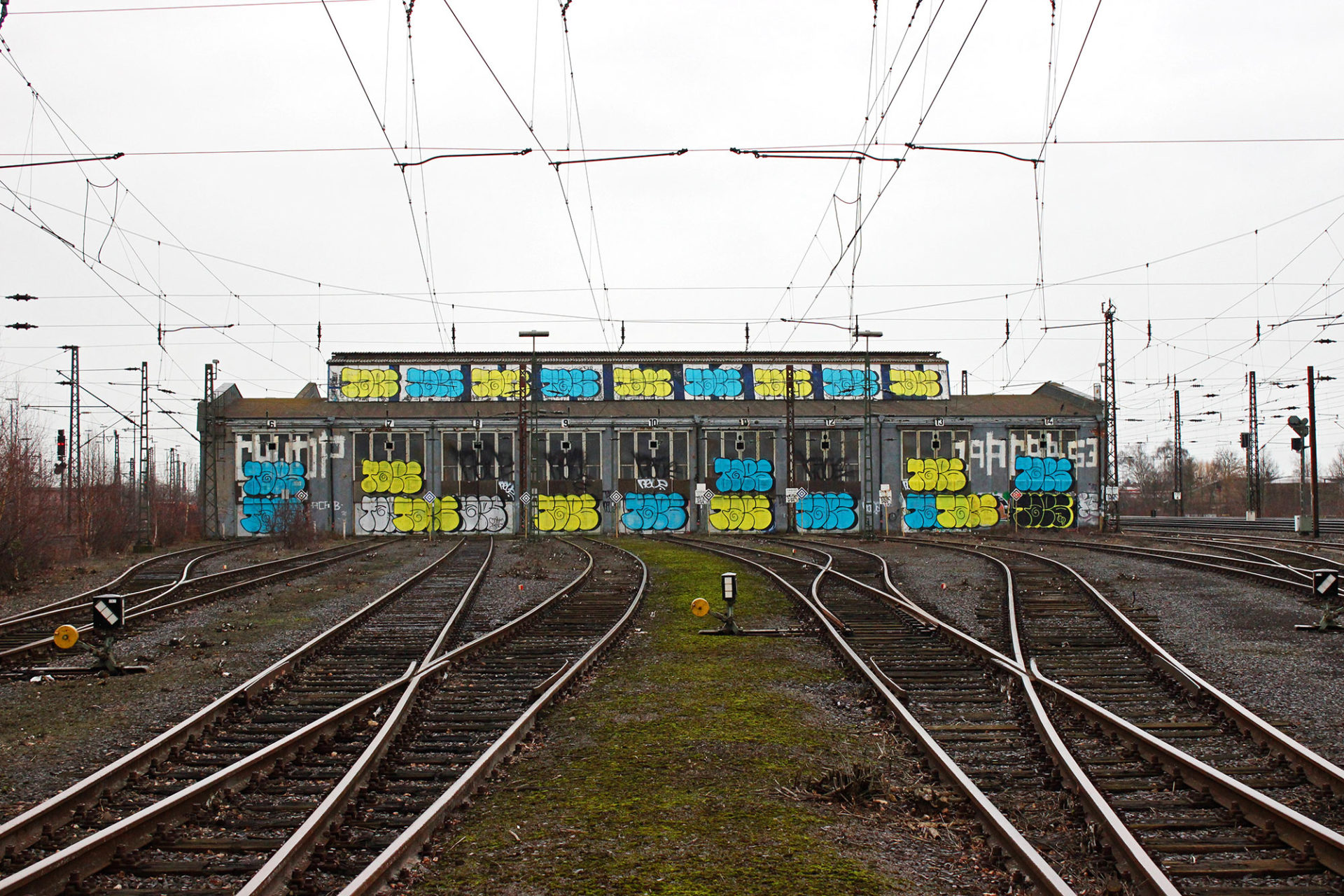
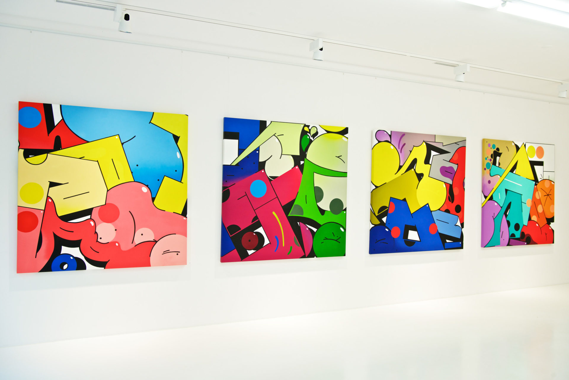
The artistic careers of MOSES & TAPS™ began independently of each other in 1994. In 2007 Moses and Taps founded the artist collective TOPSPRAYER™. In 2011 their first book INTERNATIONAL TOPSPRAYER™ was published, and to date it is the best-selling German graffiti book available. In 2014 they published the limited photo book SAME SAME™, which sold-out in hours after release. Their productions and compilations are in strong contrast to the innocent and pleasing street-art-chic these days. Such productions like “The Painted Door” in which a train door is overpainted and reappears on an another part of the train and “THE WALL™” – the bricked up train door – are known to everyone. Following the exhibitions in Paris, San Francisco and the The Art and Exhibition Hall of the Federal Republic of Germany last year, the title CORPORATE IDENTITY™ for their first solo exhibition in 2016 could not have been more appropriate. CORPORATE IDENTITY™ describes‚ “the totality of a brand or feature that characterizes a company and distinguishes itself from other companies”.
It amazes, by a superficial examination that artists themselves are assumed to have a special desire for freedom, but in fact have voluntarily defined restrictions and limitations. New Book GRAFFITI AVANTGARDE™ available here
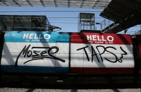
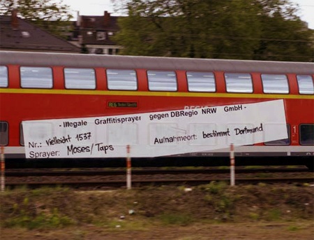
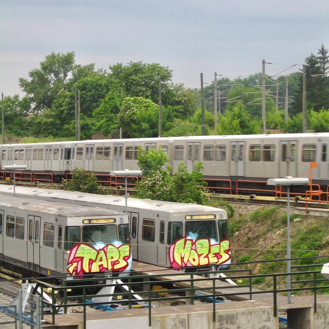
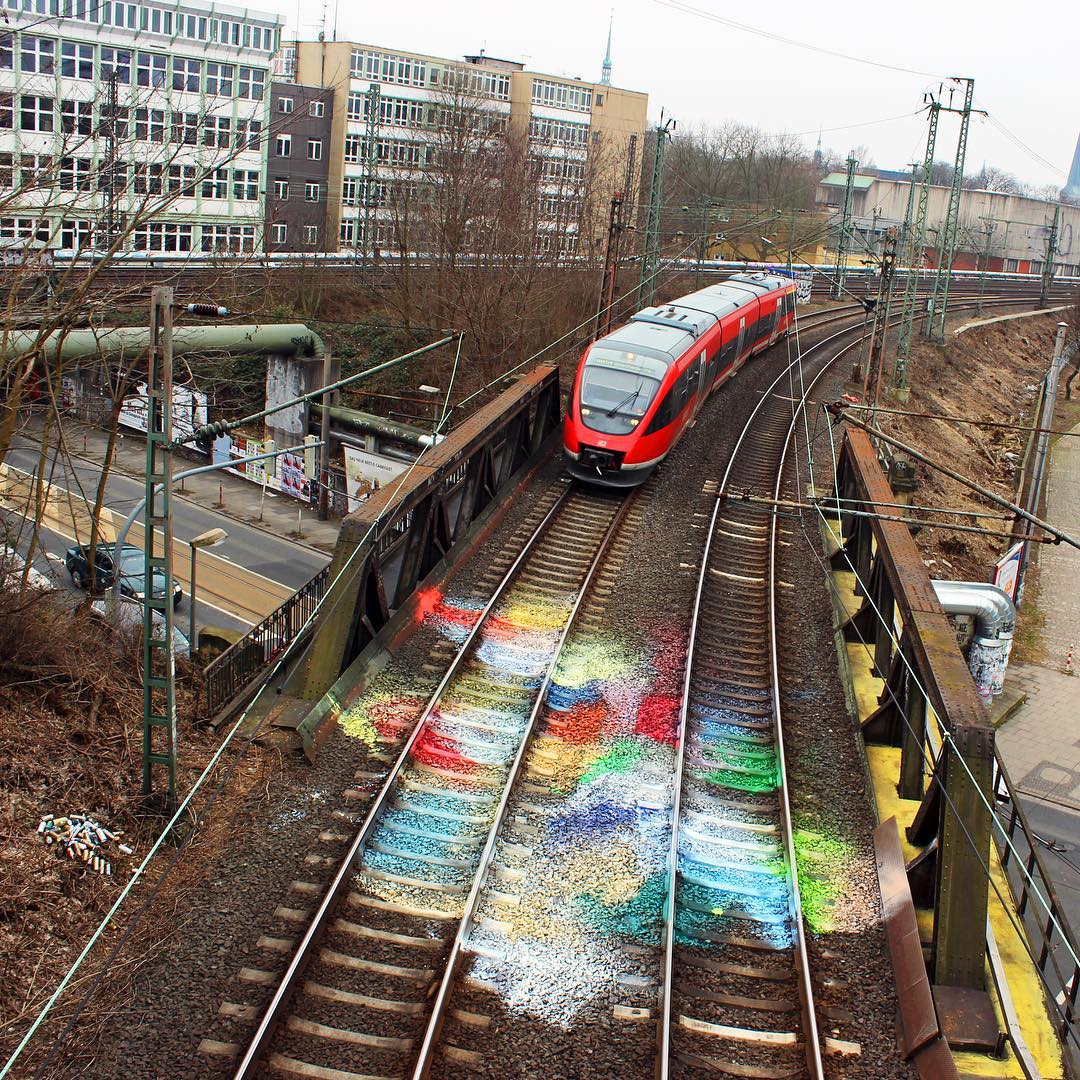
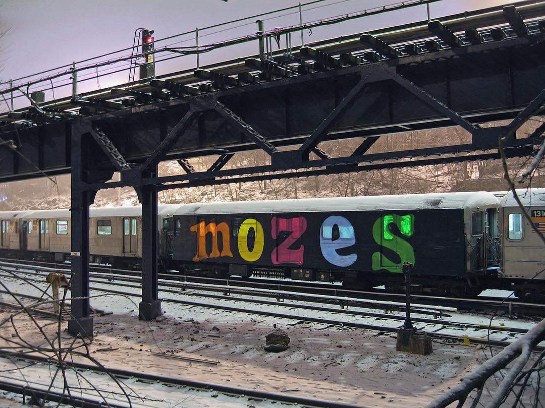
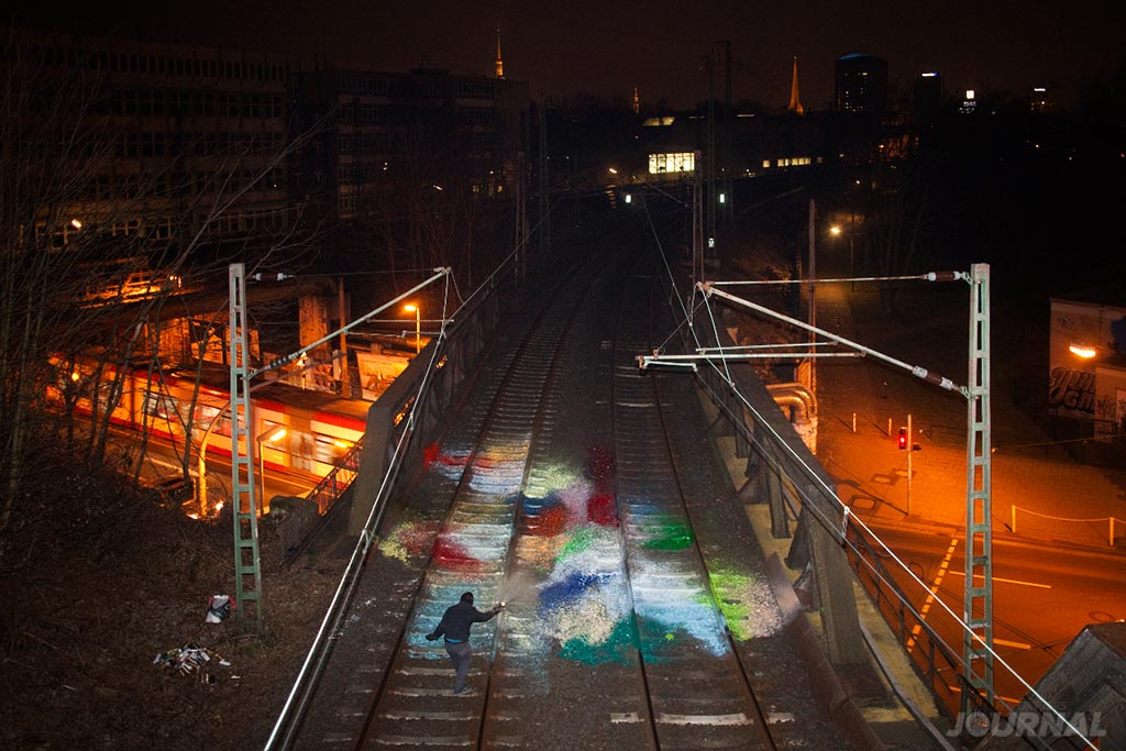
Actually, however, the development of a corporate identity can also be accompanied by a focus of the essentials, i.e. core and essence of the contents point of origin. The essence of graffiti is the repetition of the personal alias. Through repetition, perfection is created and thereby allows further development and abstraction to occur. Repetition is very easily traced and leaves a simple trail behind. It is true that there is amusement in Moses and Taps´ Oeuvre for the observer, because of the weighty context the interaction with their captors represents. The artists decided not to make the classification too easy for the individual hunter. However they continued to devise new compilations that would undo the reasoning behind the classification. There was an exchange made, their book project INTERNATIONAL TOPSPRAYER™ for 1000 trains painted in 1000 days without further ado, their names.
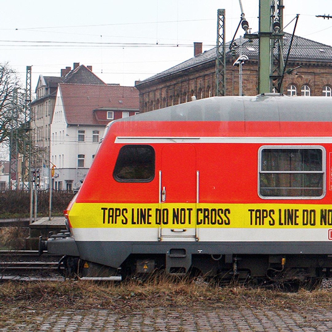
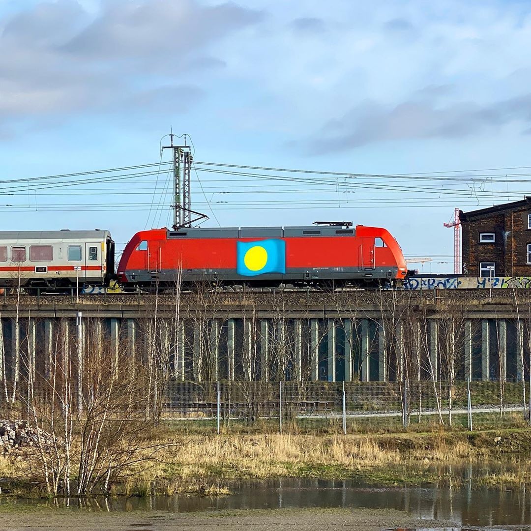
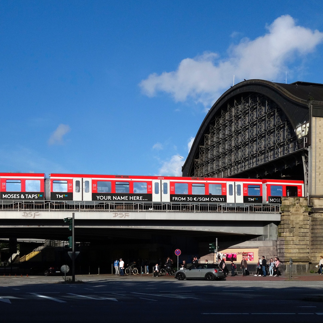
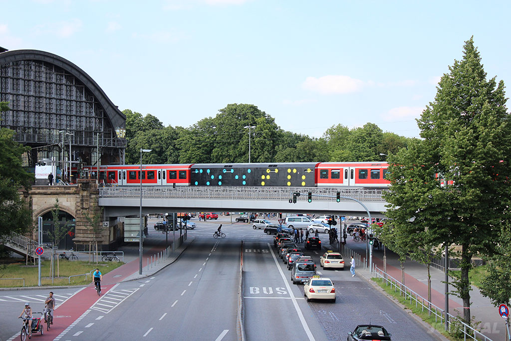
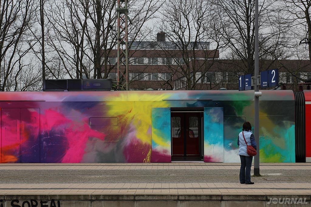
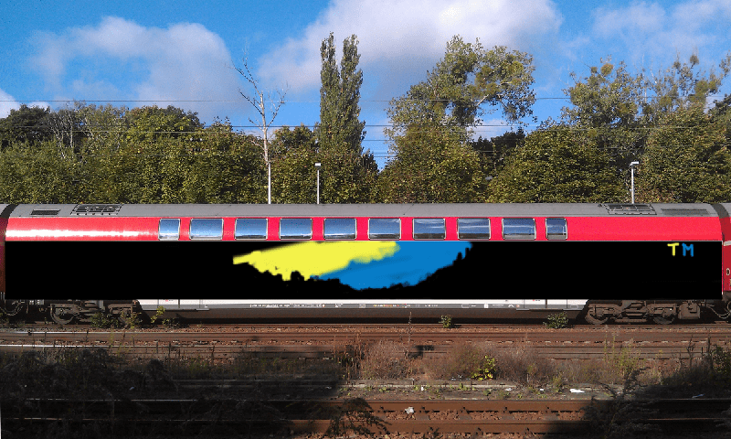
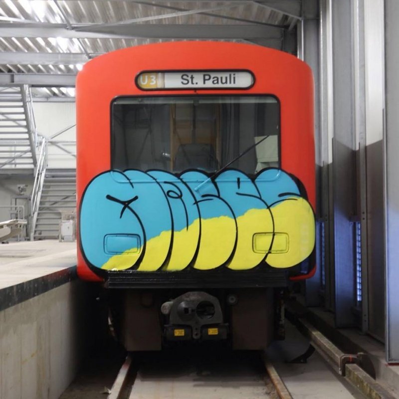
Moses became TAPS, and out of Taps, MOSES™was born. The elevated ™ symbolizes the name exchange, which winks at the conventional importance of an “unregistered trademark”. In 2010 they both consequently set about producing the series CORPORATE IDENTITY”.
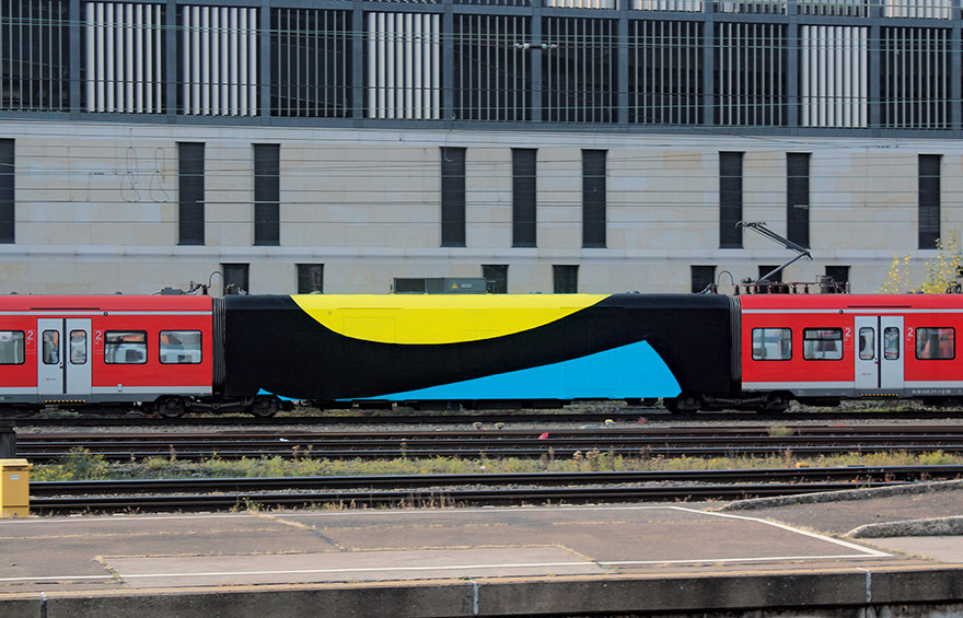
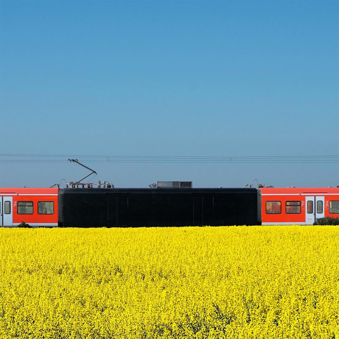
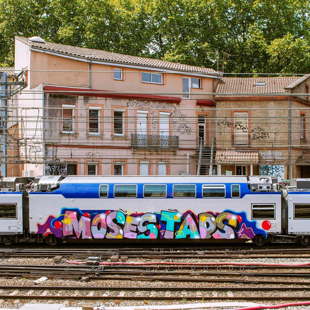
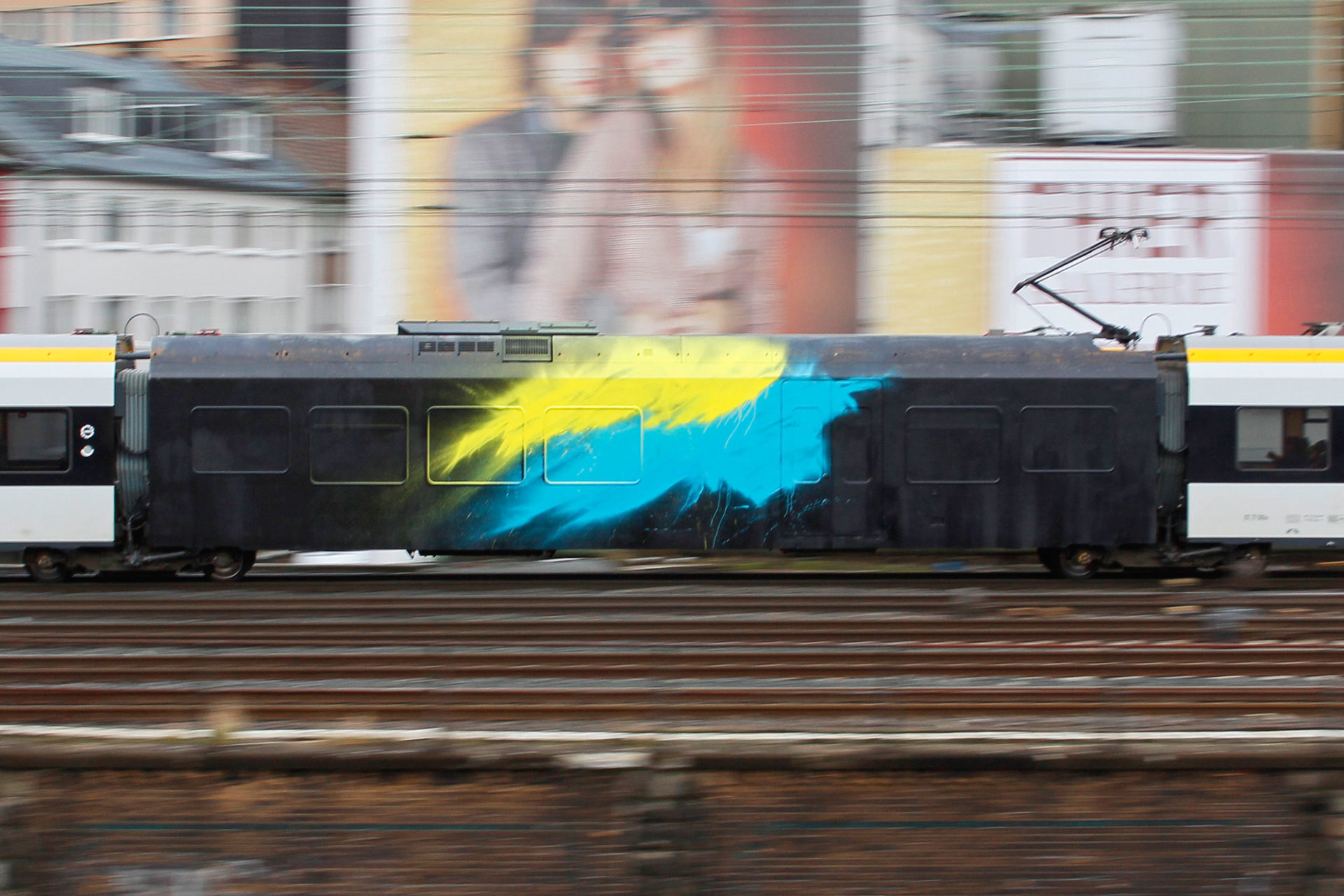
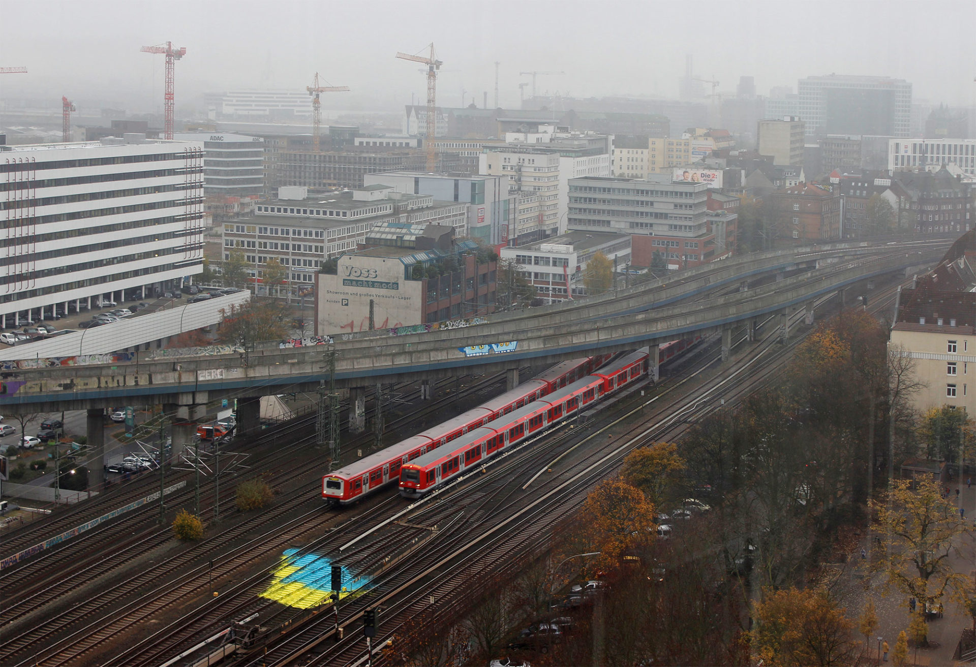
The written portrayal of the pseudonym MOSES & TAPS™ was given way by the barely tangible representation of the colors, yellow and blue. At the same time this Corporate Design served as a conceptual link between the various series, creating a high degree of recognition. (Via The Grifters Journal)
Moses & Taps on Instagram | More Street Art on Art Ctrl Del


